We use cookies to make your site experience better. Tracking cookies enables us to provide a functional Accessibility Toolbar, and easily log into your account (if you have one). For more information on how we use your data, read our privacy policy.
We use cookies to remember your customised accessibility settings to optimise your visit to our site. If you have disabled cookies, this may prevent your browser from keeping your accessibility changes.
[Delete this text] This pattern uses the cover block to display an image. You can change the overlay (either as a solid or gradient) to create some fun effects and choose your focal point. Please note that this should only be used for decorative images.
[Delete this text] Gallery images can easily be adjusted. Change and add (or remove images), increase or decrease the number of columns, add a background, add styles to individual images using the image styles feature. We recommend setting galleries to “Crop image” so everything sits nicely, linking to media so that images will open in a lightbox, and setting image size to either medium or large (not full-size or thumbnail).
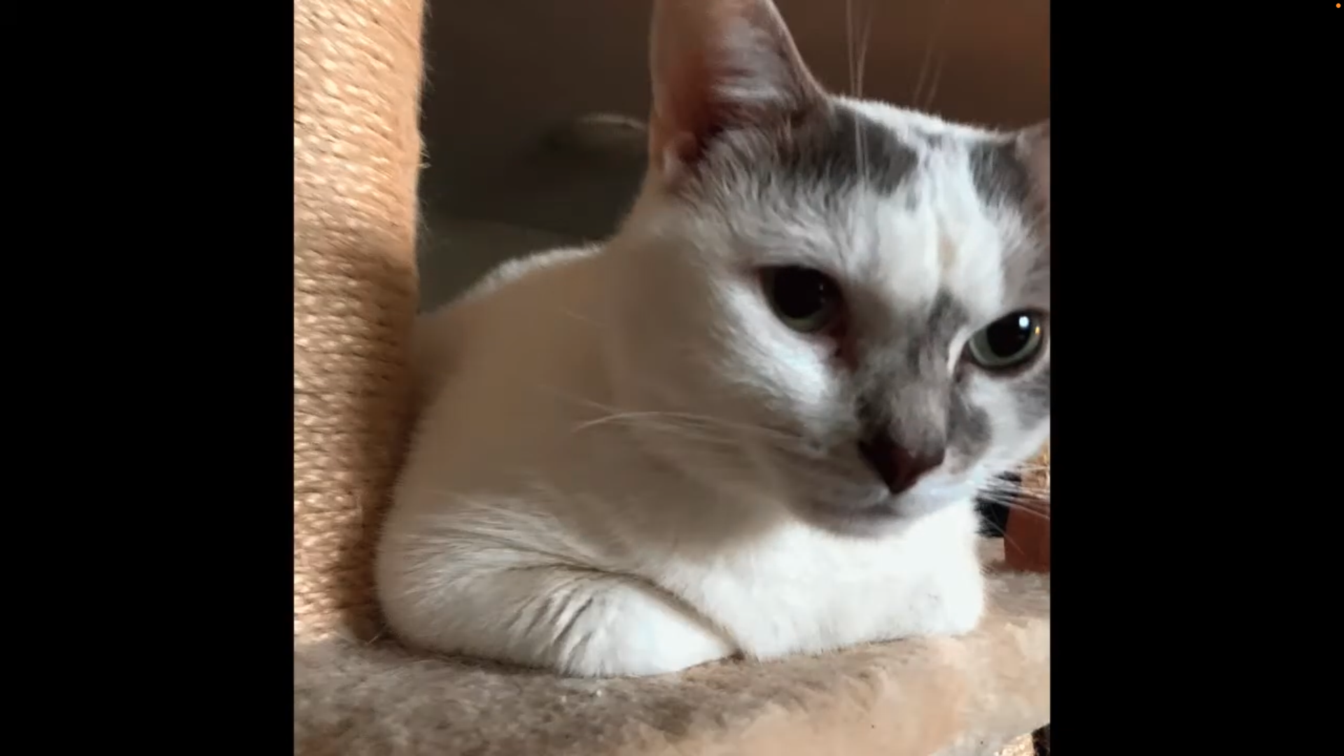
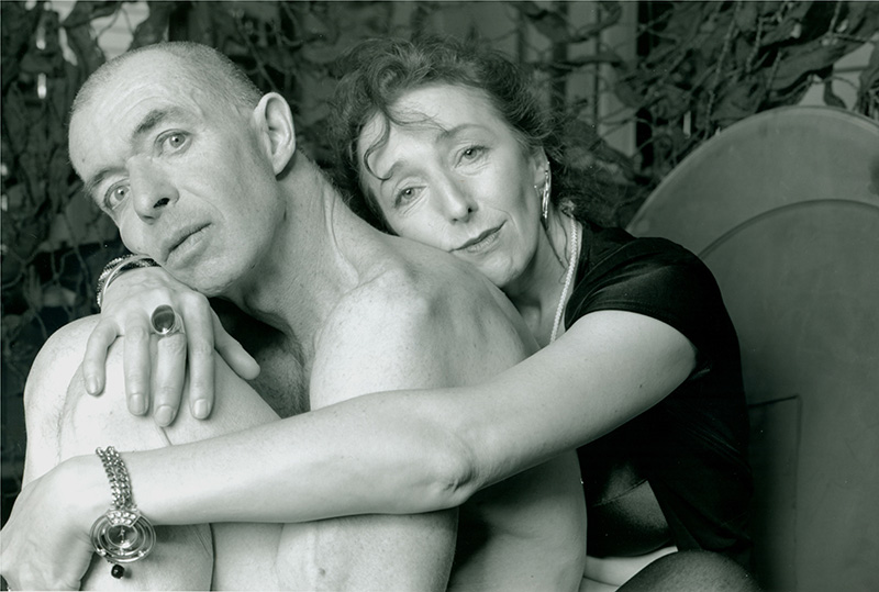
A sketch of a blue and purple beetle crawling off of a pink and orange roll of film. The background is light green.A black and white photograph of a couple sitting and facing the camera. An older woman is sitting behind a nude older man with her arms wrapped around him. The woman is smiling slightly with her head resting on his back and the man is wide eyed and resting his cheek on the woman’s hand in front of him.A screen capture from Thurga Kanagasekarampillai’s video “Life Can Change in an Instance”, showing a photo of a white cat with grey patches on its face. The cat is curled up on a beige cat tree platform, next to a sisal-wrapped pillar.
[Delete this text] Full-length and wide-length images are set to automatically be responsive based on a fix container. What does that mean? The width and height of these images are fixed based on the size of the device. As the device changes (shrinking or growing), the image within this container will resize to fill the space. For best results, images should be in landscape with the focal point placed in the center.
A series of three framed photographs hang on a white gallery wall, each a shot of a person lying in various positions on a shiny surface that reflects their image. The photos are all rotated 180°. The first shows a person’s head and shoulders, with fingers interlaced in front of their face. The second shows the same person with their arms crossed at the wrist and their head bowed. The third shows the same person with their head laid on their hands, elbows bent.
[Delete this text] Gallery images can easily be adjusted. Change and add (or remove images), increase or decrease the number of columns, add a background, add styles to individual images using the image styles feature. We recommend setting galleries to “Crop image” so everything sits nicely, linking to media so that images will open in a lightbox, and setting image size to either medium or large (not full-size or thumbnail).
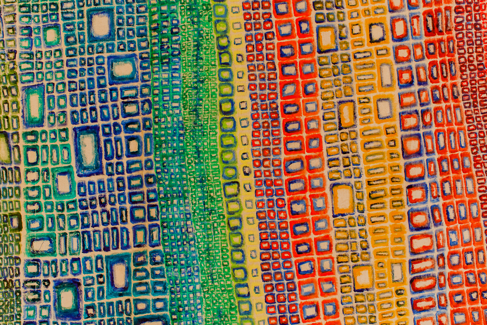
A hooked rug with an irregular rectangular shape features large sections of pastel mint green and bright magenta yarn, with smaller areas in brown, mustard, mauve and multicoloured variegated yarn incorporated at random. Across the top, dark green embroidered knots spell the word “rage” in braille.A screen capture from Thurga Kanagasekarampillai’s video “Life Can Change in an Instance”, showing a photo of a white cat with grey patches on its face. The cat is curled up on a beige cat tree platform, next to a sisal-wrapped pillar.A black and white photograph of a couple sitting and facing the camera. An older woman is sitting behind a nude older man with her arms wrapped around him. The woman is smiling slightly with her head resting on his back and the man is wide eyed and resting his cheek on the woman’s hand in front of him.A small table laid with a white cloth displaying a number of objects. In one corner there are three small bottles of liquor; beside these, a glass bowl holding a succulent, and a pink salt lamp glowing softly. In the center is a glass box of ashes, surrounded by two ceramic or glass sculpture; one a green cactus, the other a black sphere. At the head of the table, two wrapped candies lie on a black serving tray. Shot from above, a sheer rainbow scarf sits on the floor in the corner of a white gallery space. On top of the scarf are several objects: a single antler, wooden music makers, a small clay vase, and two round pieces of wood cut from tree trunks. The wood slabs each display small trinkets including strawberry candies, a monarch’s wing, polished stones and flat clear marbles.Details of “Mountain”, an abstract painting with squares and rectangles in different colours and hues, aligned in different columns.The Story-Making module map with icons of colourful animals all drawn with a single line, each labelled with a title and several subtitles in bullet points.
The fuchsia raccoon in the top left reads “Orienting” with bullets for “overview”, “multimedia stories”, and “power to change”.
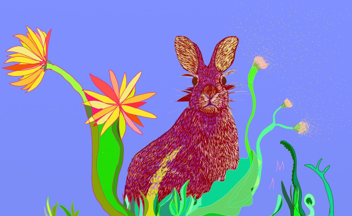
The blue rabbit in the bottom left reads “Sounding”, with bullets for “setting up WeVideo”, “voice over, sound & music”, “tutorials and resources”, and “guiding questions”.
The teal deer in the top center reads “Gathering” with bullets for “writing prompts”, “vulnerability”, “language”, and “guiding questions”.
The orange squirrel in the bottom center reads “Envisioning” with bullets for “setting up WeVideo”, “representation & revisioning”, “working with the visual”, “resources”, and “guiding questions”.
The green bird in the top right reads “Assembling” with bullet points for “setting up WeVideo”, “editing”, “access” (with subpoints for “captioning”, and “audio description”), “finalizing the story”, and “guiding questions”.
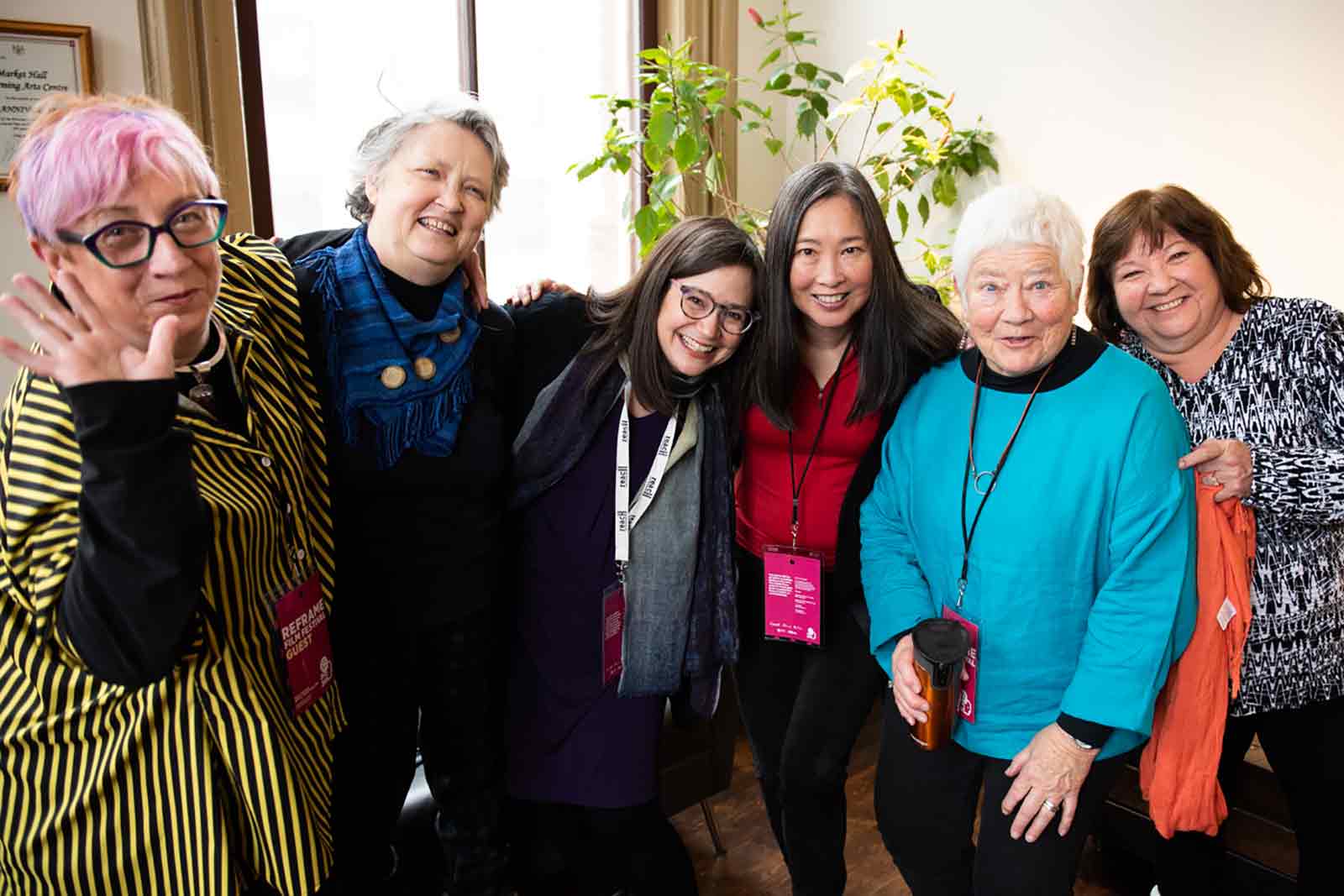
The red butterfly on the bottom right is labelled “Moving” with bullet points for “story screening”, “how stories travel”, and “guiding questions”.A group of six participants at the “Aging Vitalities” film festival screening pose for a photo, smiling with their arms around each other’s shoulders. Four of them wear pink festival passes on lanyards around their necks.Gallery visitors looking at an arrangement of different sizes and shapes of textile and embroidery artworks hanging on a white gallery wall. The works shown are a panel of fabric with red and white stitching in a diamond pattern, a long banner of fabric with traditional Hungarian patterns stitched in a series of panels in red, white, and black, and a grouping of cut out fabrics arranged in a cluster on the wall.A pile of many dozens of small rectangular strips of wood, arranged in a rough line. A few dozen strips of wood are suspended above the line, as if falling onto the pile or floating away from it.
[Delete this text] Full-length and wide-length images are set to automatically be responsive based on a fix container. What does that mean? The width and height of these images are fixed based on the size of the device. As the device changes (shrinking or growing), the image within this container will resize to fill the space. For best results, images should be in landscape with the focal point placed in the center.
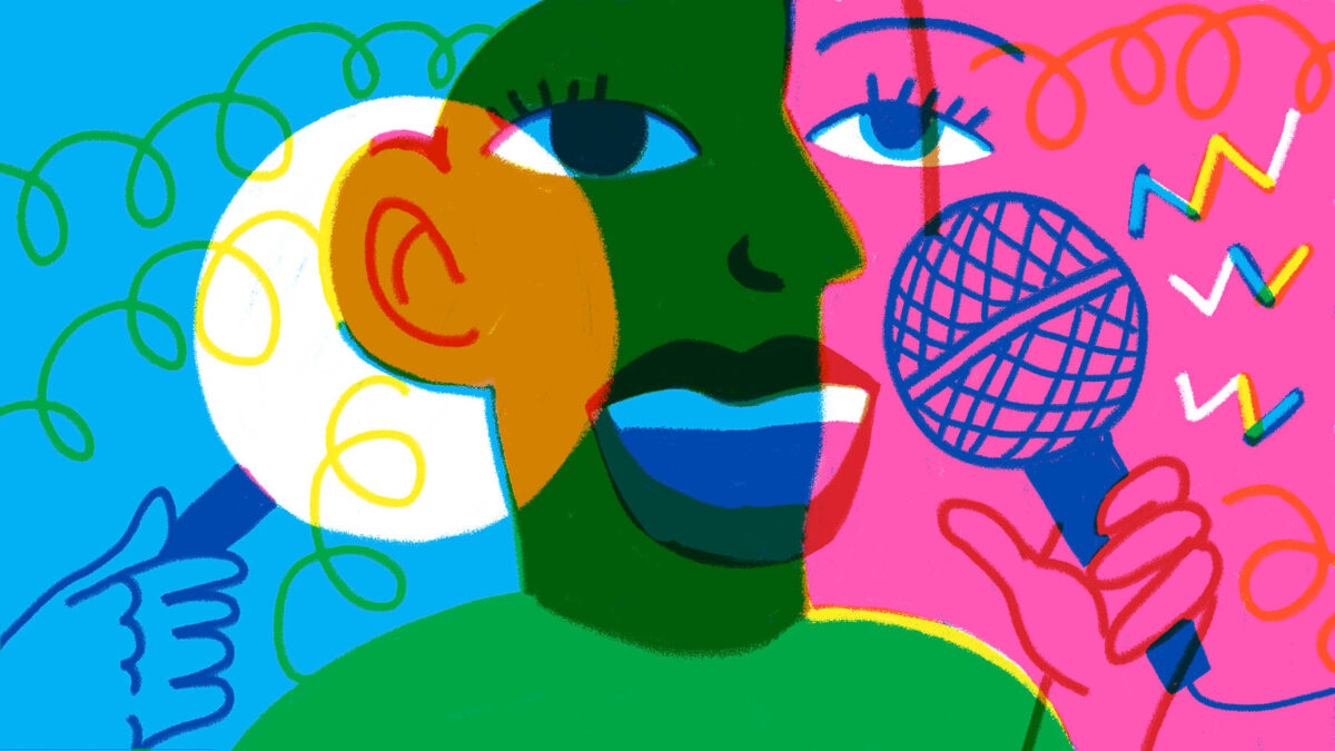
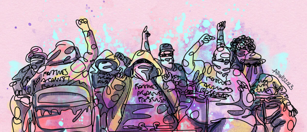
“AntiFa Tank Division” by Allison Tunis. Original photo credit – Katie Loncke. Line drawing of fat protestors in pink, purple, and blue watercolour. Inspired by the work of Fat Rose and the AntiFa Tank Division, Allison included some real world activism in their illustration. She recommends that you check out their site to get your own Fatties Against Fascism shirt and other swag.


